Project Introduction
This project explores visual rhythm across a three-page publication, utilizing a consistent grid system and typography while varying the emphasis between imagery and text.
the challenge
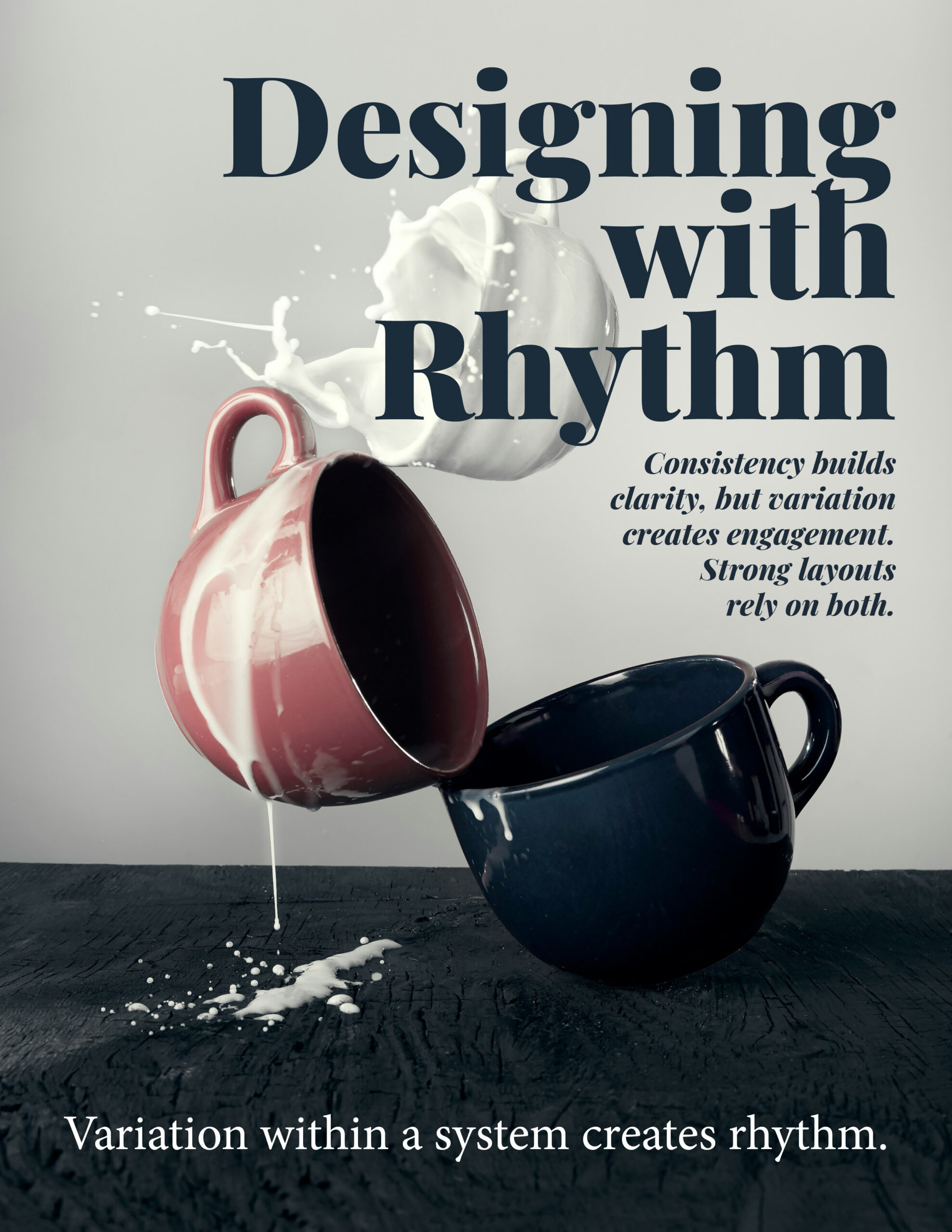
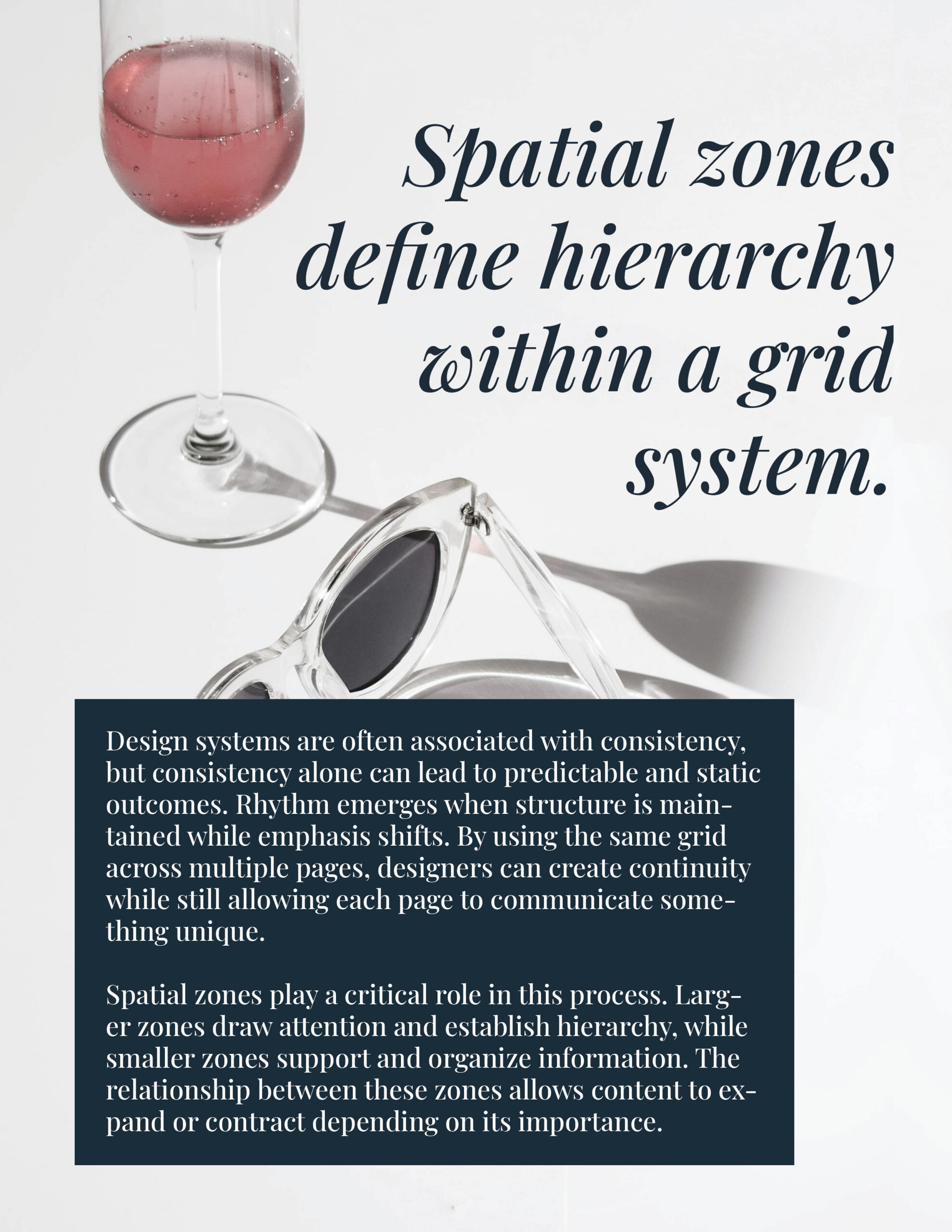
The challenge was maintaining strict structural consistency in margins and type styles while drastically shifting the content hierarchy; progressing from an image-led layout, to a balanced composition, and finally to a text-driven design.
our solution
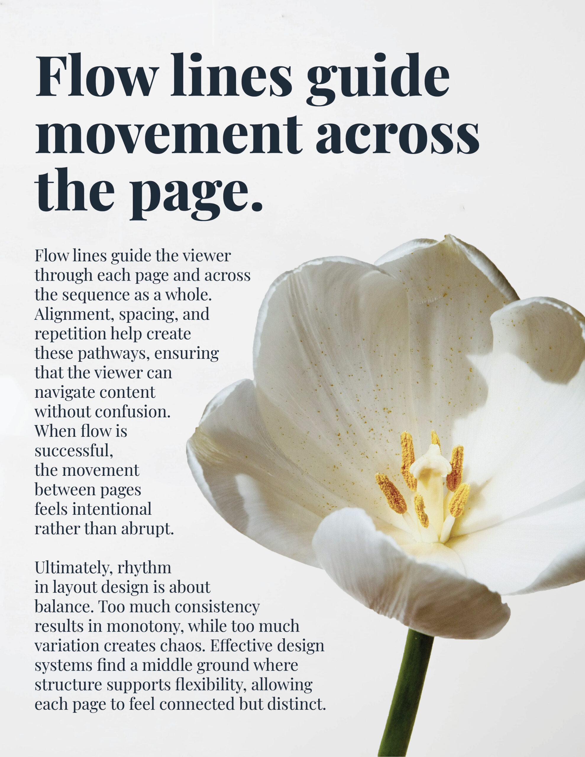
Specific spatial zones and flow lines were applied to manipulate hierarchy across the sequence. The layout shifts dynamically: the first page uses a large, immersive image to lead the viewer, the second establishes clear zones to evenly balance the imagery and body copy, and the third relies on typography to drive movement while the image plays a supportive role.
the result
The resulting sequence demonstrates how structural consistency supports layout flexibility. Earning a perfect 20/20 score for its thoughtful execution, the final design successfully proves that while consistency builds clarity, intentional variation creates engaging visual rhythm.