
Project Introduction
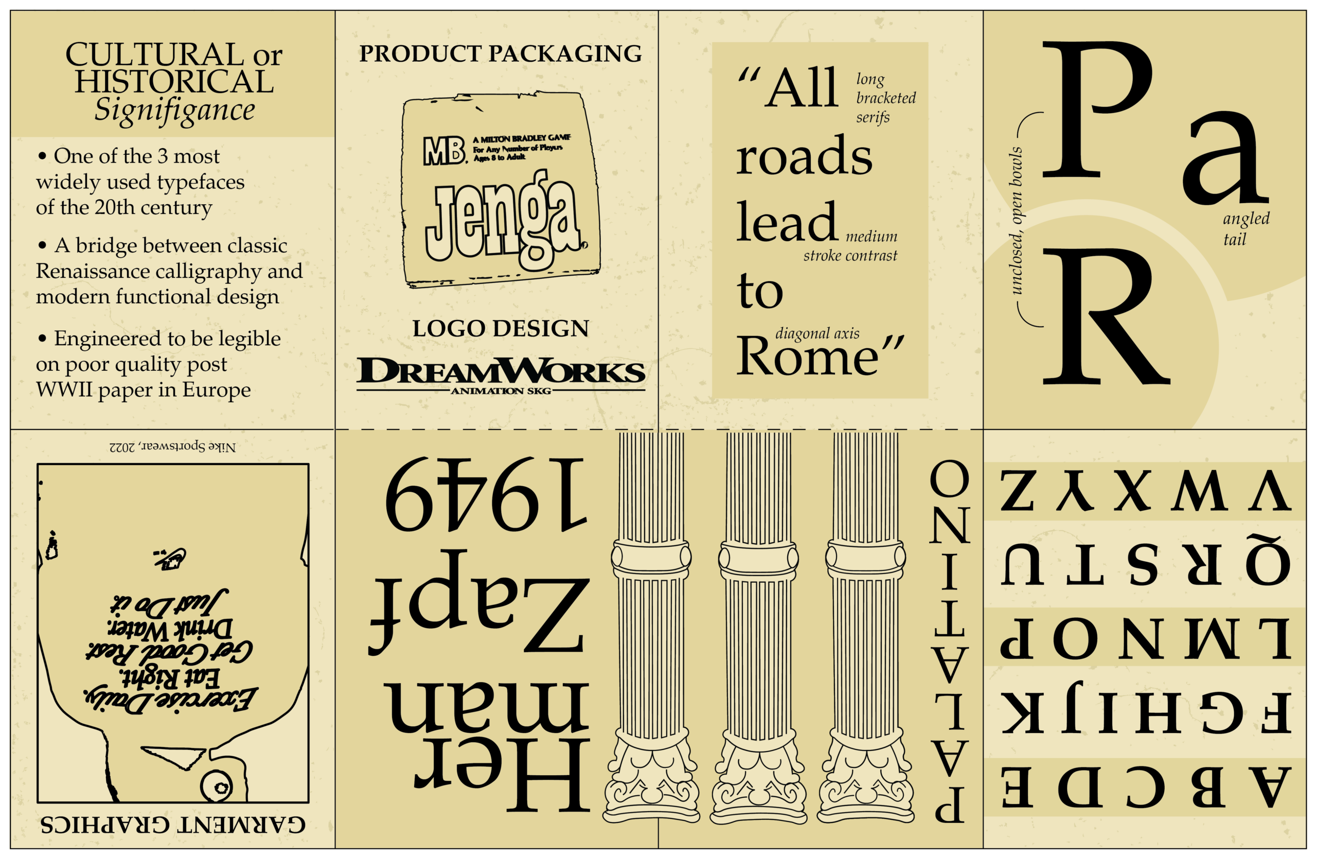
This project is a folded typographic specimen zine that explores the history, structural anatomy, and cultural significance of Hermann Zapf’s 1949 typeface, Palatino.
the challenge
The primary challenge was organizing a diverse range of information—spanning from post-WWII historical context to specific character anatomy and modern commercial applications—into a compact, multi-panel folded format. The design needed to balance dense educational content with engaging visual hierarchy without overwhelming the small canvas.
our solution
Developed a structured, panel-by-panel layout that guides the reader through Palatino's legacy. The design incorporates classical visual motifs, such as Roman columns, to reference the typeface's roots in Renaissance calligraphy, while dedicating distinct sections to highlight its specific anatomical features (like long bracketed serifs) and its versatile application in modern branding, such as Jenga and DreamWorks.
the result
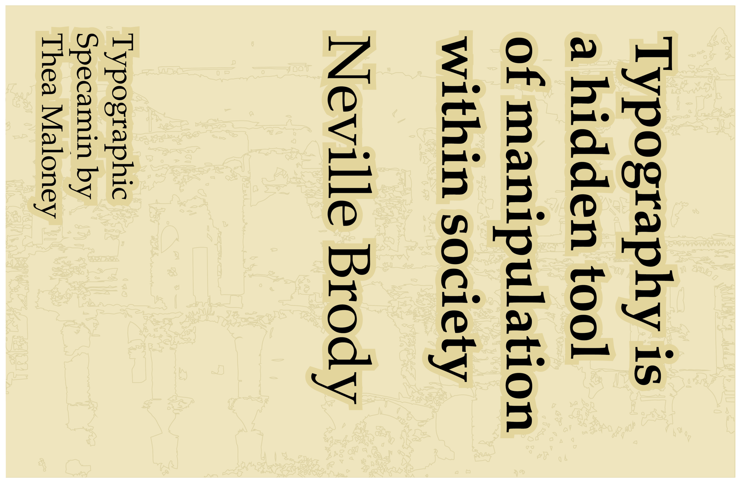
The resulting zine functions as both an educational typographic guide and an engaging physical artifact. By contrasting Palatino's functional origins as a legible typeface for poor-quality European paper with its massive footprint in global pop culture, the publication effectively proves the Neville Brody quote featured on its cover: that typography operates as a powerful, hidden tool within society.